Graphic Design

Overview
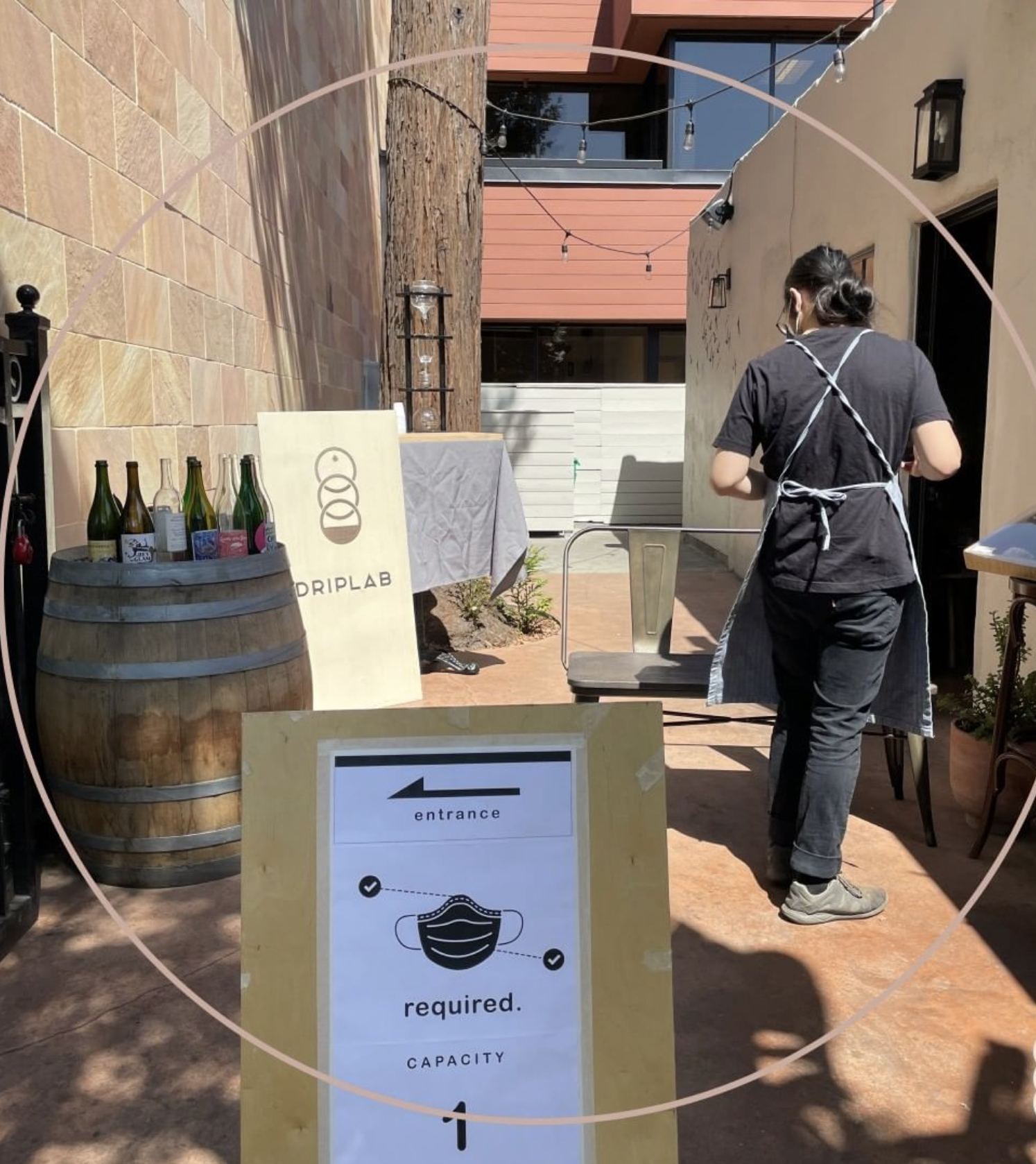
Driplab is a boutique, coffee brewing business. It specializes in small-batch coffee from around the world to make the best cup of cold brew.
The client approached me, with the idea of creating a logo that showcased the brewing process.
The ask was to deliver a logo and label for branding bottles and general merchandise.
The Problem
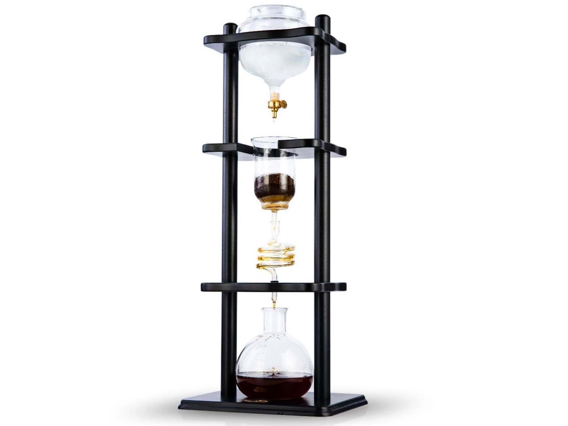
The image is the "Yama Tower" a Japanese, coffee, cold brewer, and Driplab's signature brewer.
The owner of Driplab was looking for a logo that incorporated the "Yama Tower". The logo needed to fit the branding of the business' minimal aesthetics.
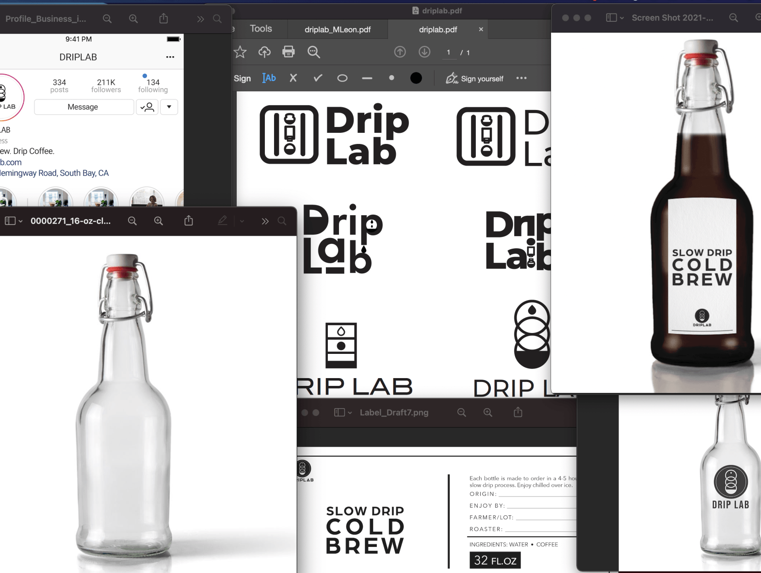
Most pressing, the logo would need to be printed on a label and placed on a curved glass bottle. The label would have to withstand condensation from the cold coffee and bottle reuse.
The Solution
I accomplished the solutions through a series of emails and meetings with the owner. I tried involving the owner through each step of the design process through to the final product.
Goals set to accomplish the task:
.
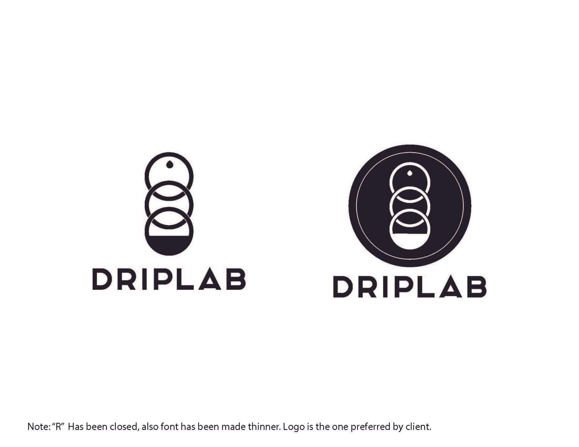
- A Minimal logo with a circular motif to represent the Yama Towers vessels and process
- Use of a san serif font that is geometric and complements the logo allowing it to be used with or without it.
- Vinyl Sticker for the bottle, will allow wear and tear from the elements and reuse
- Mock up's of the label and logo on the bottle and various objects that it will or may appear on
The Design
The Logo
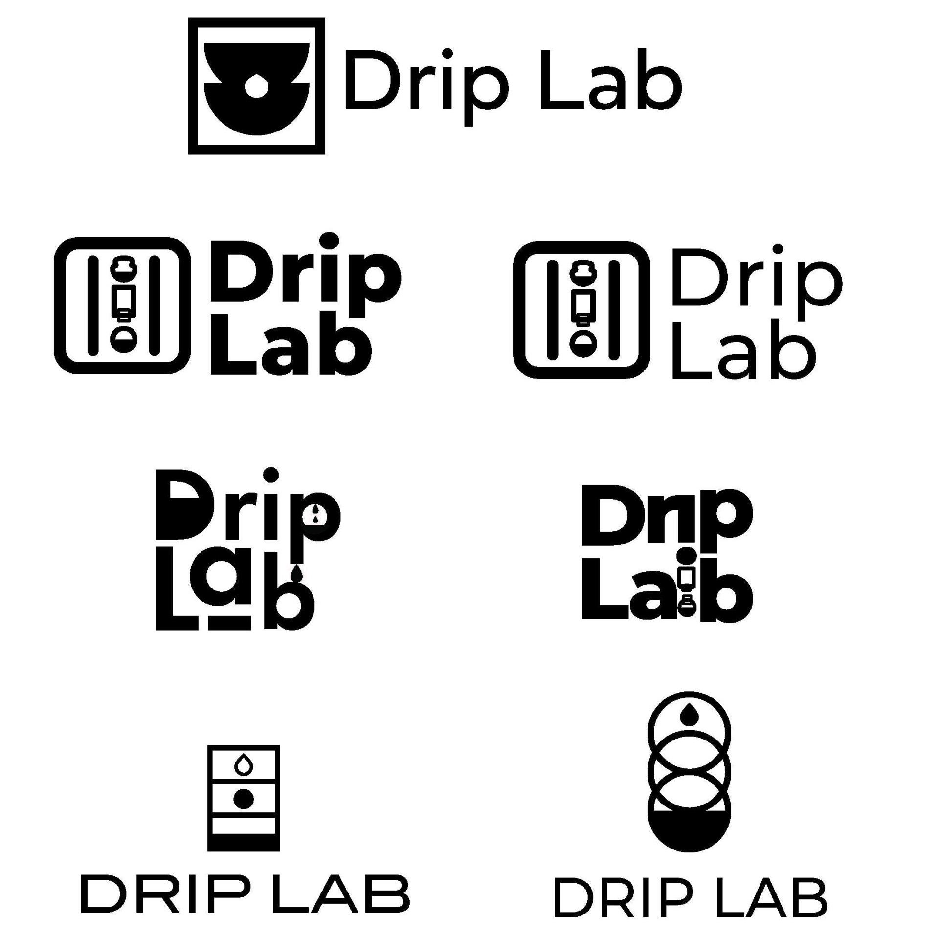
I designed the logo through sketches and typeface research. The client's initial proposals lead the first steps
I designed 10 different logos and narrowed them down to 4 that I presented to the client. After the client chose his preferred design it went through many iterations.
The end result was a minimalist logo that best illustrated the brewing process and identified with the client and his brand.
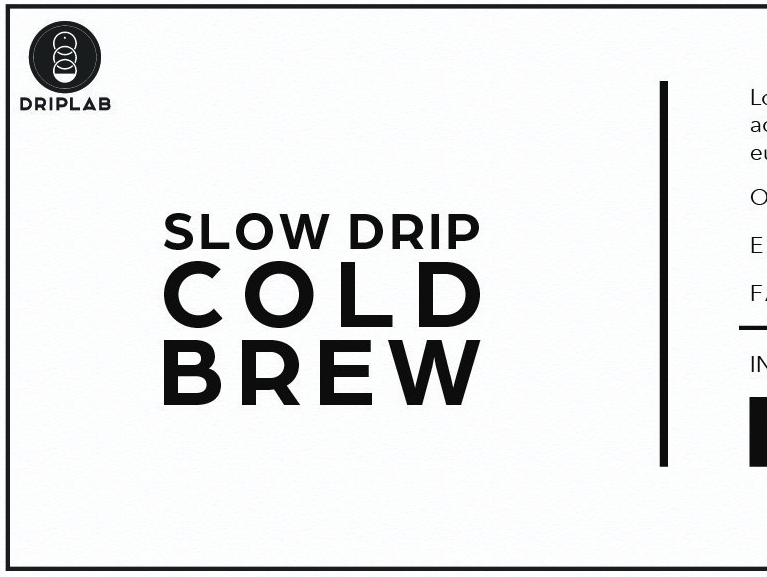
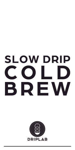
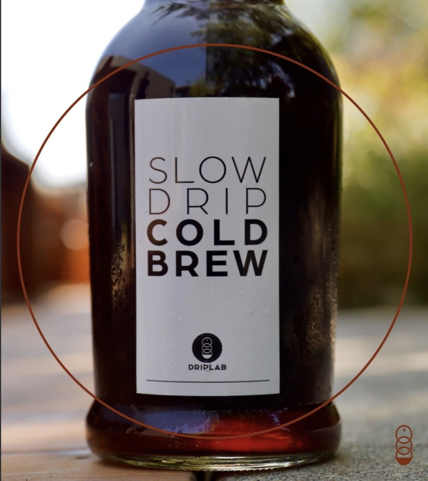
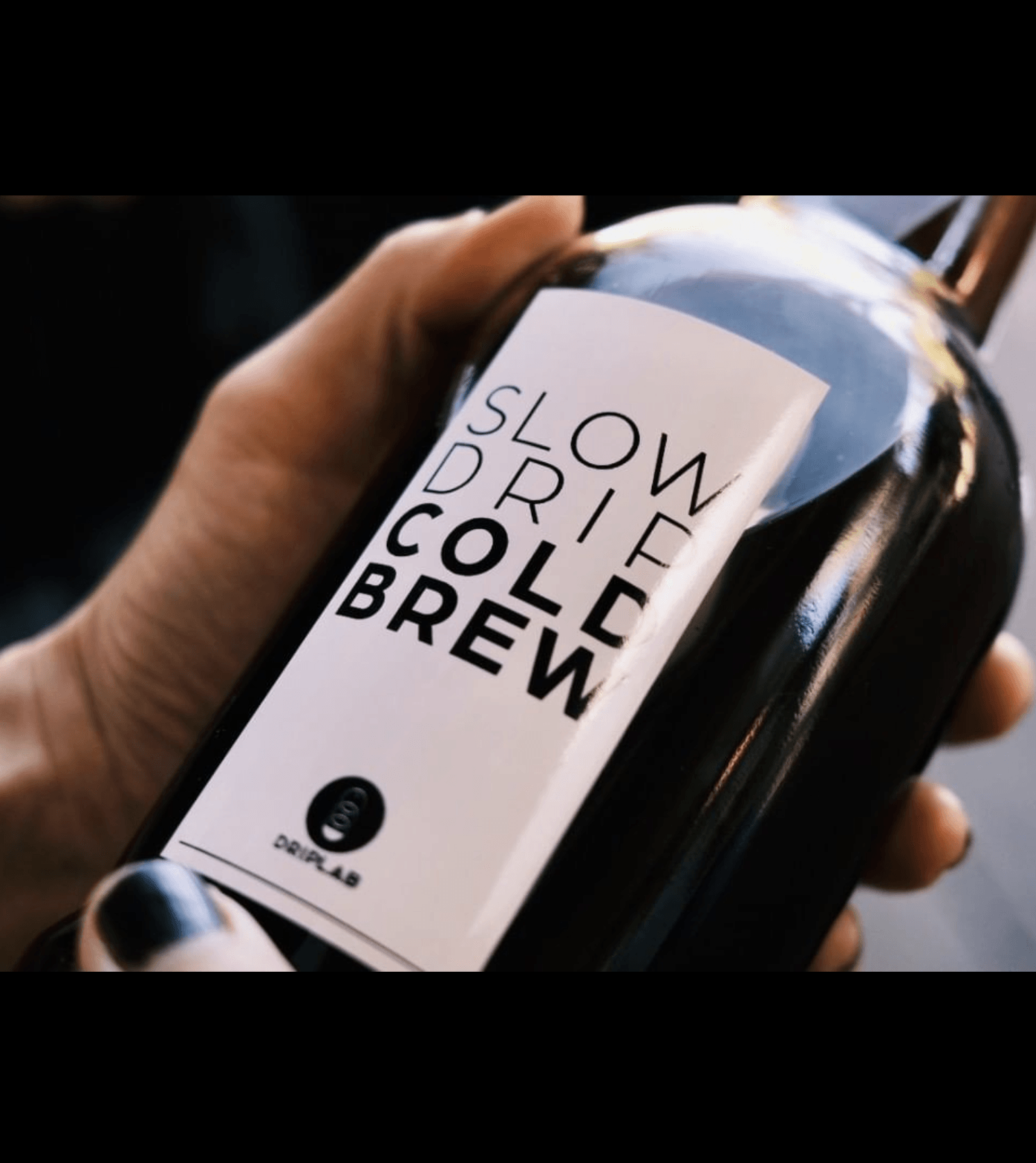
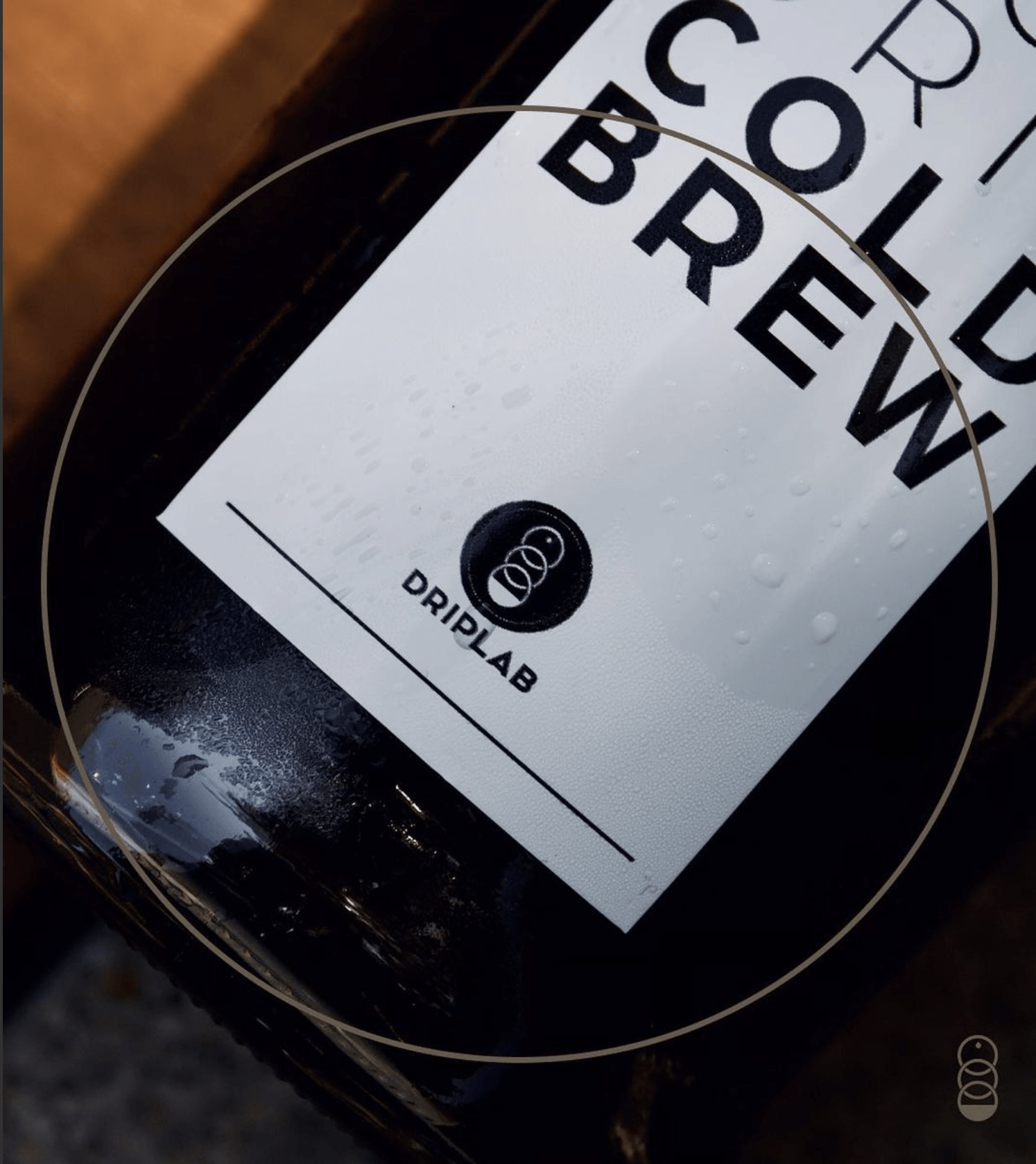
The Label
The label on the bottle needed to withstand reuse, much like a beer growler from a microbrewery. Since the client wanted a minimal black and white label the best solution was to have it printed on vinyl. The vinyl could withstand water and many refills.
The bottle the client first proposed was a straight cylinder. So the label started as a horizontal design that wrapped around the bottle.
Later on, the bottle changed to one that had a traditional curved shape. I had again come up with a label design to fit a vertical curved bottle, but also keep the already hashed-out design. It seemed I would have to redesign the label, but by chance, the solution was simple and only required resizing the font and rearranging the text.