Overview
ToumeiTools is an application that provides free utilities with the intent to help users edit and debug data sets.
There are similar tools online, however, the majority exist as stand-alone applications that have been developed and designed by developers with the developer in mind.
The idea for ToumeiTools is to make the tools user-friendly and available all in one place. The goal is that everyone in the team from the developer to the product owner can use them with ease.

The Problem
Design three main utilities:
- Compare Lists
- JSON Formatter
- Password Generator
People using similar tools may not be worried about what it looks like or that the interface is not intuitive or breaking 1 or all 10 of Nielson's Heuristics. The typical user wants to be in and out with a JSON file formatted or the CSV lists compared.
So how do you design utilities to get the user in and out while improving on and keeping the tool familiar?
The simple answer was to start by looking at what exists online, making note of the functions and behaviors the most used tools are doing well. Then ideate how those functions and behavior can be improved by the implementation of UX best practices and interface design.
The Solution
- Design a basic concept
- Make the tools responsive, mobile devices are crucial they're easy to use, fast, and readily available across all demographics.
- Make main components visible and language straightforward.
- Create consistency across the application.
- lastly make sure of accessibility; readability and legibility.
The Tools
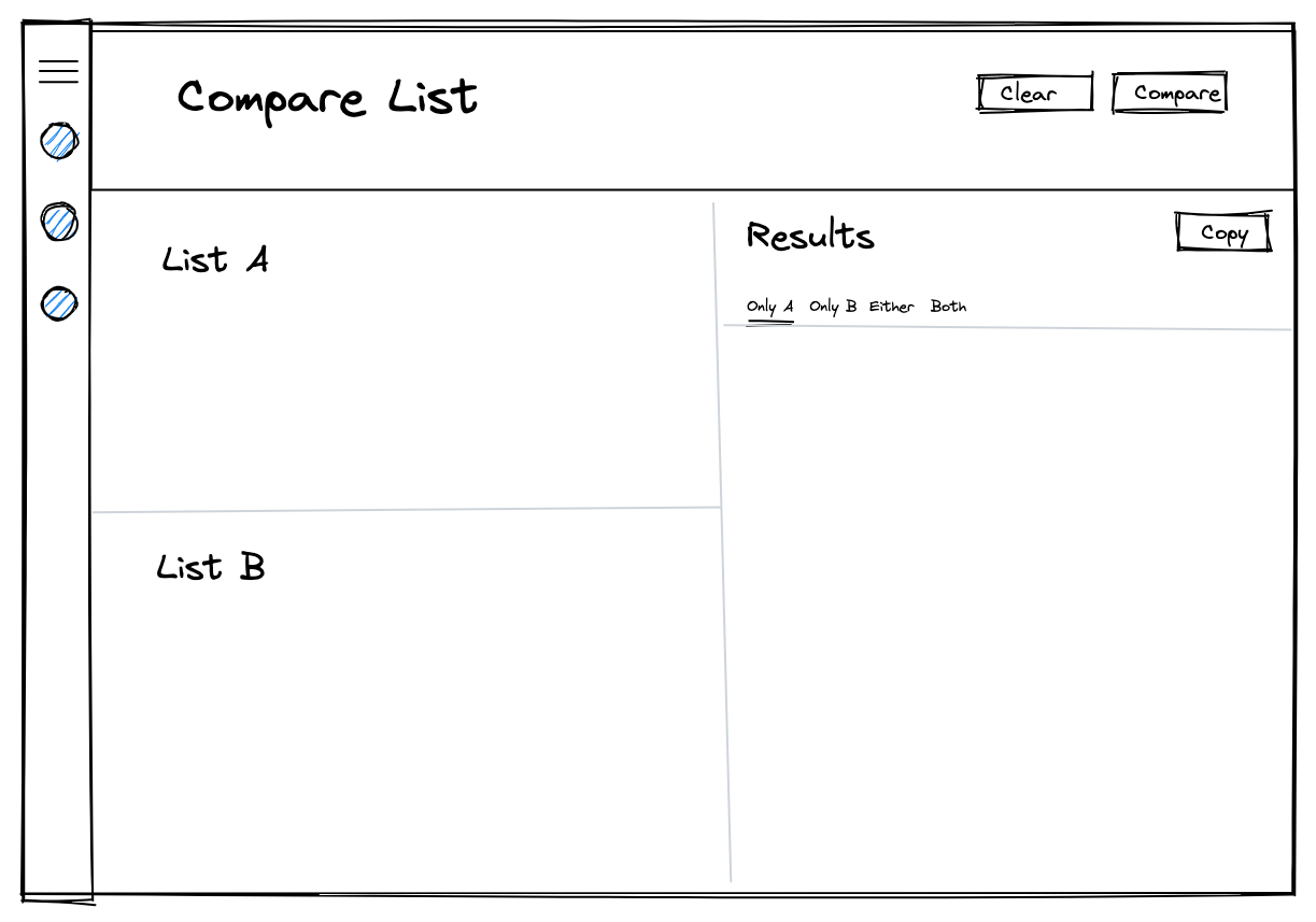
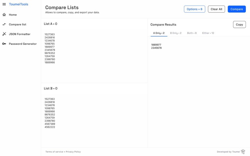
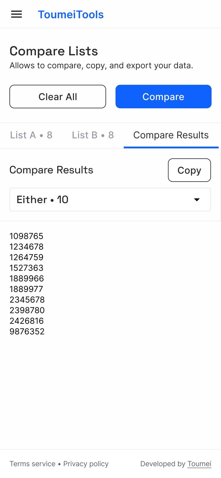
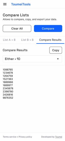
Compare Lists
Allows users to compare two lists of data. Giving the user four main results:
- Data that only exists for "List A"
- Data that only exists for "List B"
- The intersection of "Both" lists
- The Union of "Either" lists
Once the user compares results they can copy and paste them into excel sheets or where ever their data may need to live.
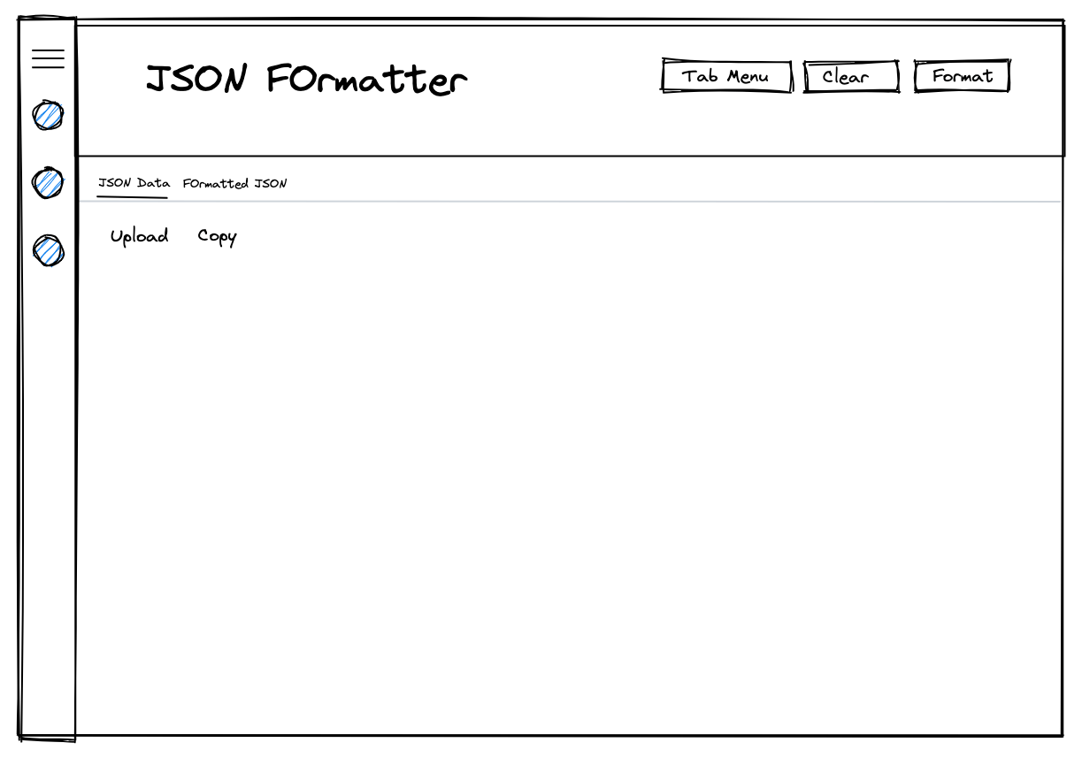
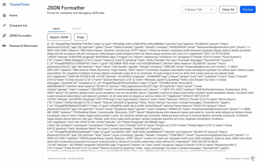
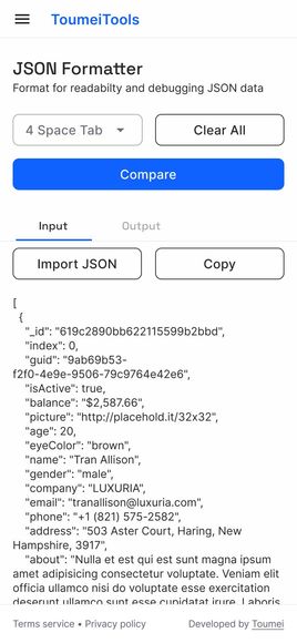
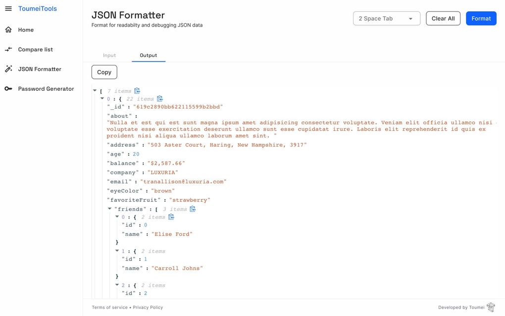
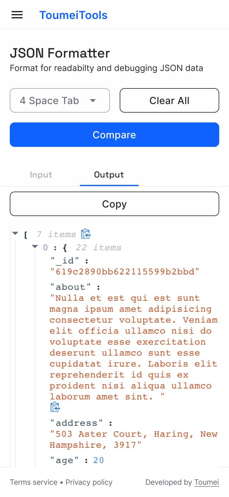
JSON Formatter
JSON files tend to have no line breaks making them cluttered and compact. Eligibility makes JSON code hard to read and thus debug, this is where the formatting application comes in.
The "JSON Formatter" allows users to upload JSON files, tab the data, identify errors in the code, and format data to allow the user to debug and better read the data.


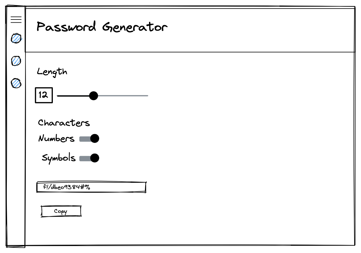
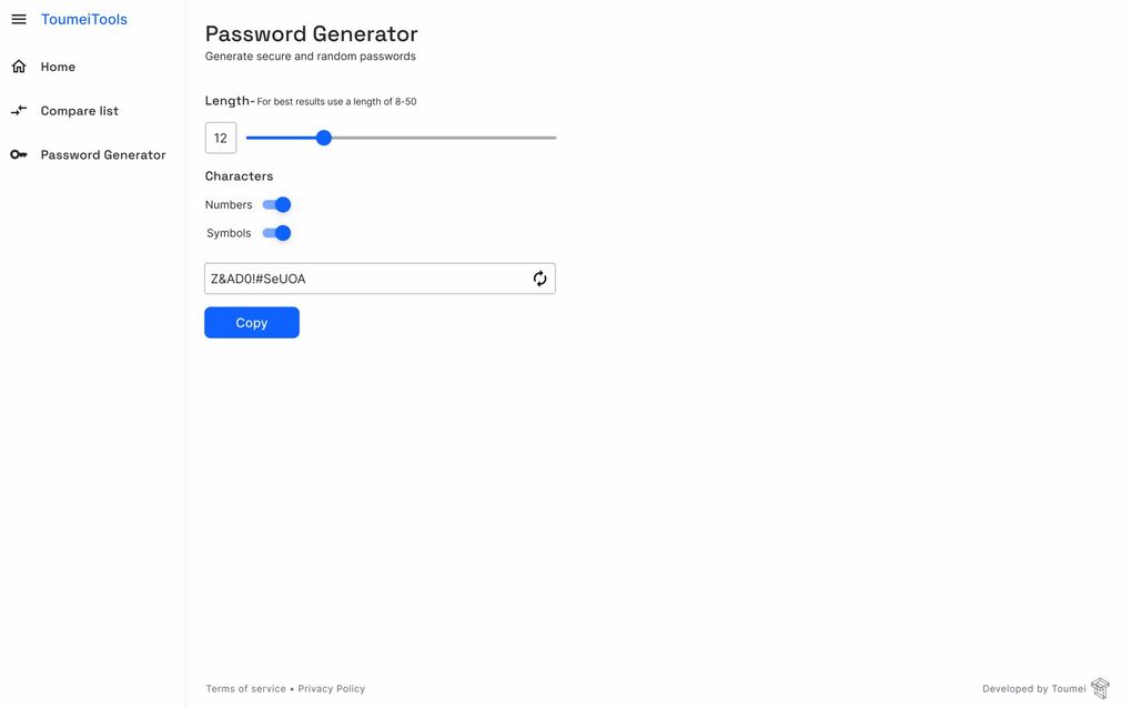
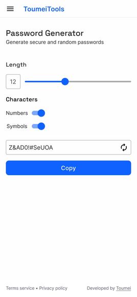
Password Generator
The password generator is designed to create random and secure passwords of various lengths and characters.
Random passwords are more difficult to guess giving the user better security.
Also being able to generate a quick password allows users to have a variety of different passwords for each service. Since using the same password for multiple services can make it much easier for the user to be hacked. quick and random password creation solves the issue.

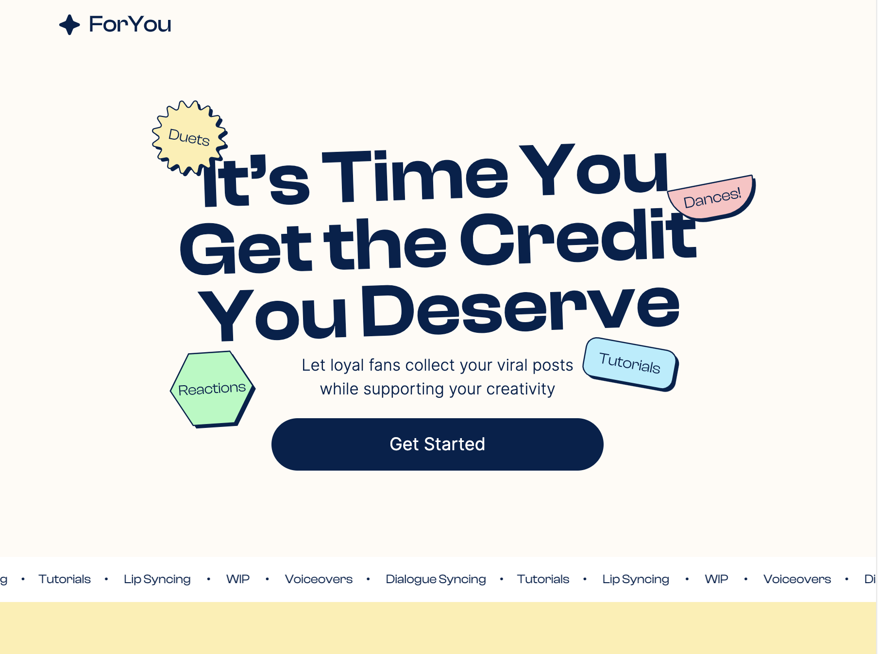
Overview
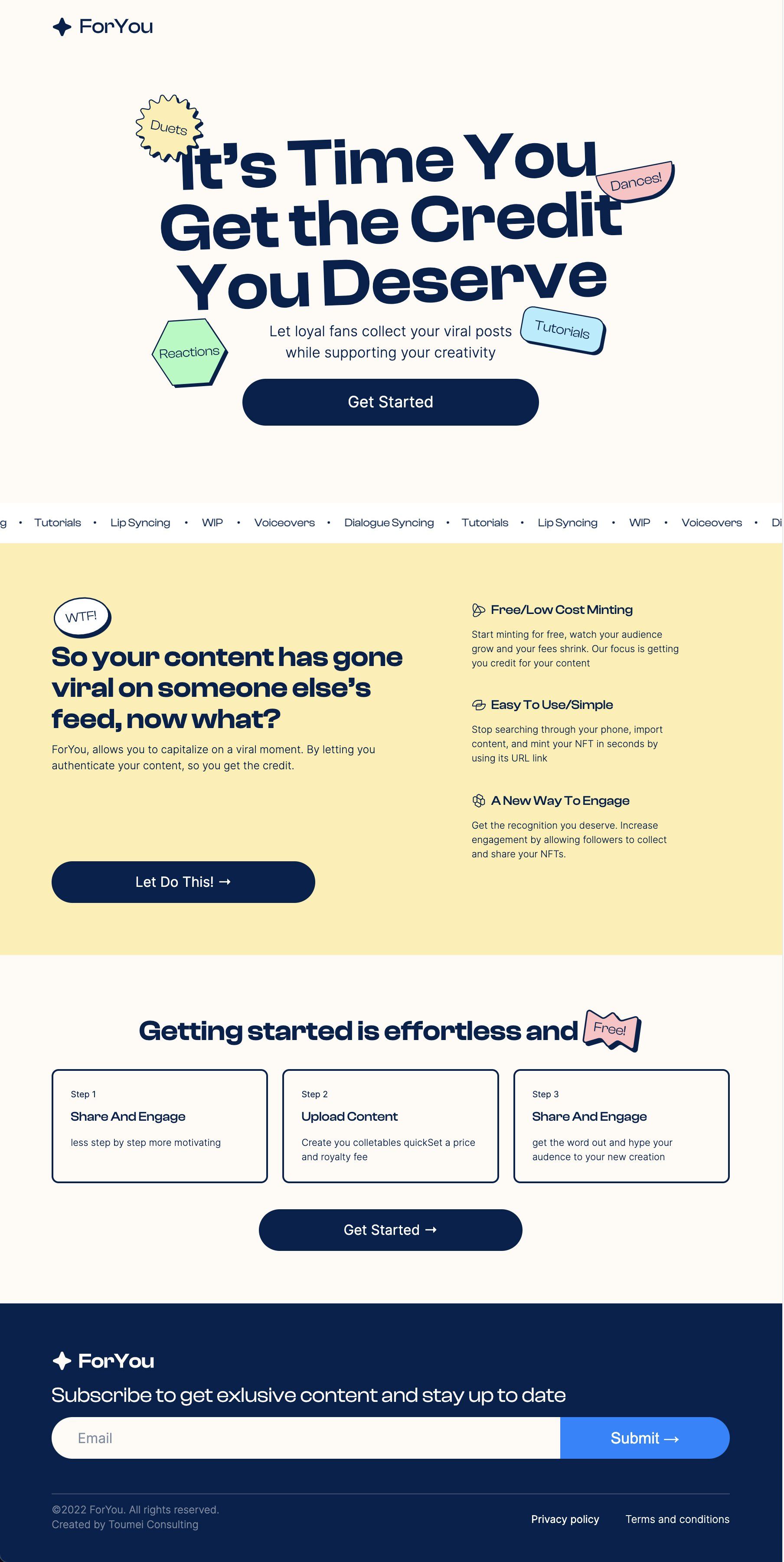
ForYou is an application that allows users to turn social media content into NFTs. The benefit of converting content to NFTs is it allows users to time stamp their content. The NFT in turn protects their intellectual property, so they get credit for their creative work.
The Landing page was designed as a marketing page to get leads from prospective users and give visitors an introduction to the product.
The Problem
The landing page was designed with a basic budget and with the ForYou project still in development. This meant much of the marketing information gathered from a finished product would not be available for use on the landing page.
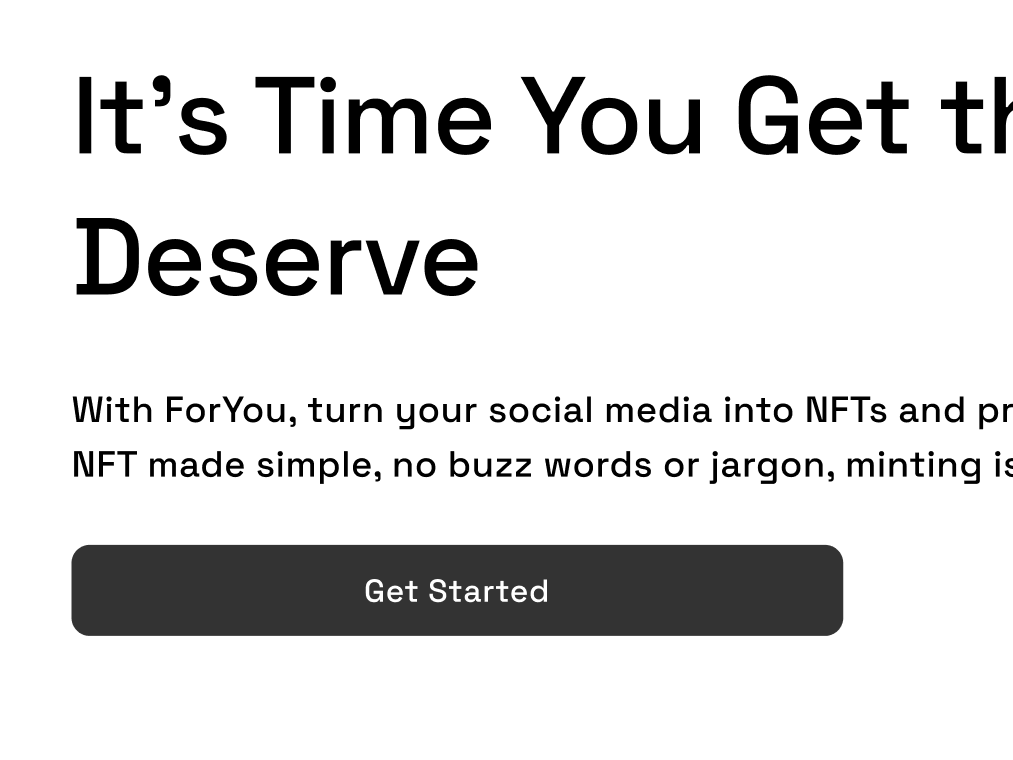
The goal for the landing page was to create a simple, informative marketing page, with a strong value proposition.
The main goals for the landing page were:
- Identifying the potential value of the application
- To use simple language to explain its functions
- Make the topic of NFT relatable to all users
- Reach out to our target audience

The Solution
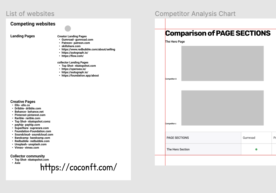
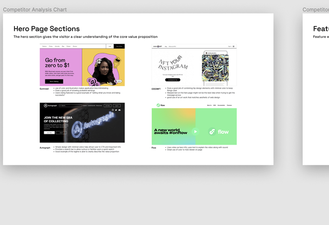
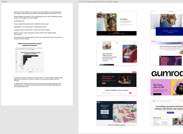
The Landing page was created in a series of steps. First, research was done on competitor landing pages, the best landing pages were put into a list. From that list, 4 landing pages that best matched our expectations were put up against each other in a competitive analysis.
Early Insights
After the initial research spike, it was evident that the majority of the landing pages were divided into specific sections. The sections were aimed at their target audience to create a high converting landing page.
Getting Started
The Landing page was created to market the ForYou application and give users an introduction to its features. My goal was to deliver a strong value pitch, Identify the user's problem, and give a simple walk-through.
My Role:
I worked on user research and analysis of competitors landing pages. After the initial research phase, I created the preliminary designs for the mobile and desktop landing pages by making sketches and low-fidelity wireframes. Lastly, I developed the copy for the landing page.
The landing page was designed with feedback from the lead designer.
The Analysis Phase
After pairing the list of landing pages down to 4, I had to figure out what to compare each landing page by. They shared similar info sections and I decided to compare them by those sections. I figured this was the simplest way of measuring their ability to generate value and leads.
Finding Common Intersections
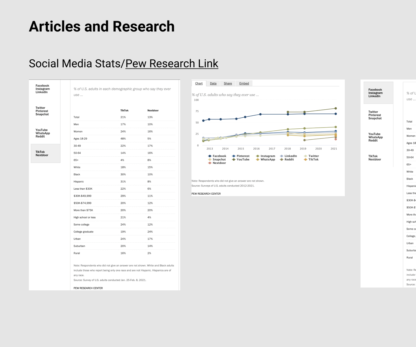
I decided on the sections based on best practices observed on competitor websites. Articles from trusted companies and groups such as the Nielsen Norman Group provided aid in the process
The sections chosen were as follows:
- The Hero Page
- The Feature Walk Through
- How It works
- Social Proof/ Testimonials
- Featured Work/ Persons
- User App Resources
- Footer


Big Sections, Little Landing Page
An issue faced was the application was not a finished product. This meant much of the information required for sections would not be available. After consulting with the lead we decided on 3 sections that could provide enough crucial information to a user.
The Sections Chosen Were:
- The Hero Page
- Problem Section
- How it Works
These three sections were chosen because of their importance and ability to inform users about; what the application provides, How it solves the user's problem, and how to get started with the application.
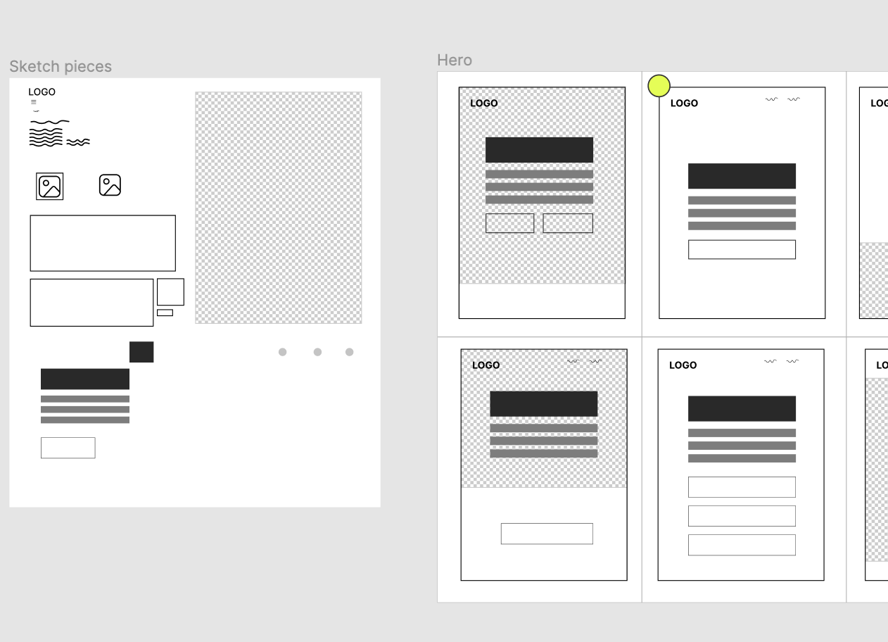
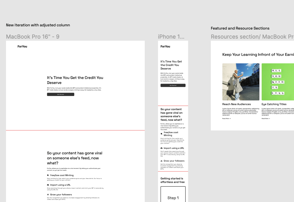
The Sketches
The Obvious step after research was to get sketching. Through a series of exercises, mobile and desktop sketches were completed. Feedback from the lead helped in choosing sketches to turn in wireframes.
Working Out The Wireframes
The wireframes were based on the initial sketches and started after consulting with the lead designer. The wireframes went through various iterations. The final design was a basic template that could be stylized with type and copy.

Creating The Copy
After finishing the wireframes and creating a basic layout the more pressing matter was creating copy for the landing page.
The copy required research and an understanding of how the landing pages use copy to create value for their product.
The goal was for the copy to be:
- Concise- Use plain language, fewer punctuations to help readability
- Objective- Be truthful and less of a salesman, Fewer buzzwords, write for the audience
- Scannable- Clear large headings, bullet points to break up text, open space around text for quick reading
- Emotive- Write to appeal to the emotions of the target audience
- Human- Make the text conversational
Conclusion
The landing page design is for prospective users who have a novice knowledge of crypto and NFTs. The end product was a scrolling landing page made up of 3 sections.
The goal was achieved of creating a strong copy, and a basic landing page that could be stylized to branding specifications. The Lessons learned were the importance of copy and specific landing page sections. Without proper research on these parts, the landing page would have had a weak value proposition.